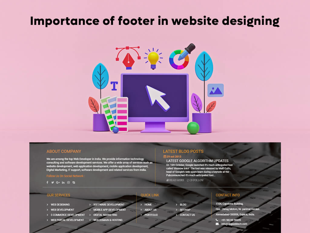
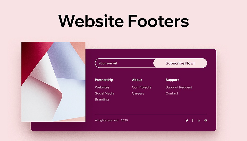
The website footer designing of your website is one of the most overlooked parts of your website’s design.
If you’re a web designer, the bottom of the page may seem like the last place you’d test, but ignoring it means you’re missing out on a huge chance for optimization.
As conversion strategists, we see the footer as a vital part of the top navigation. The best website footer designing act as a safety net for your site’s visitors and aid conversion rates by providing a clear route to the rest of your site. However, this is arguably more relevant to your mobile experience than your desktop one.

The importance of maximising your website footer designing
There are three main reasons why people travel to the website footer designing: employment, trust signifiers, and last-ditch navigation. When we’ve looked at session recordings of website visitors, we’ve seen users repeatedly scroll to the bottom of the home page before realising they were looking in the header rather than the footer (for example, careers).
Such missed opportunities can result in users becoming disoriented and eventually quitting the site. And if users are getting lost on your home page, it’s a clear hint that you should begin experimenting with different footer designs.
You may now be asking yourself, “Is it truly worth my time and work to conduct tests on my website footer?” Shouldn’t our attention be drawn to what’s “above the fold”?
Having a beautiful website footer designing is essential since it makes it easier for your customers to shop on your site.
Smart Insights’ A/B test of a luxury handbag website found a 27% boost in sales conversion and a 16% increase in revenue per visitor due to a simple change of the website footer. Furthermore, according to ChartBeat’s findings, 66% of user engagement took place “below the fold.”.
A “fat footer” may be one of the most straightforward and cost-effective ways to increase conversions, but it will also take up very little of your time.
Is it necessary to improve the current footer of my website?
If you’re having trouble finding problem spots with your footer, using technologies like heatmaps and user session recordings can help. The absence of activity in your website’s footer usually indicates that your visitors aren’t making it all the way to the bottom of your website or that you haven’t included anything worthwhile in your footer.
It’s a common blunder for businesses to include the same information in both the header and footer of their website. This redundancy does not contribute any new information or value for users.
The issue is: How do you tell the difference between the two?
When it comes to headers vs. footers, the primary difference is that the header should be a condensed roadmap of your site’s most valuable content. When visitors have trouble navigating your site, the footer serves as a sort of “safety net” for them.
Here’s an example of a header that highlights the most important parts of your site for visitors to see when they arrive at your landing page (product offering, about us, contact, etc). Additional information about the organisation, such as your terms of service or privacy policy, might be included in the bottom instead of the header. Over-optimization is another common website footer designing blunder.
Only use keywords or phrases that offer value to your brand or motivate visitors to take action in optimising your footer for search engine optimization.
The next step is to consider how to make the most of the space in your website footer designing. With our help, you’ll have an effective footer in no time.

Effective Website Footer Designing Must Have These Features
Here are the eight most important characteristics of a well-website footer designing. The following is critical information to include in your footer:
- Logo
- Navigation
- Contact details
- Support
- Copyright, terms of service, privacy policy
- Company info (i.e. Careers)
- Social media icons
- Call-to-action
Security and certification logos are available as an add-on.
1. Logo and brand imagery
As a general rule, you should use your brand imagery in your website footer designing navigation, just as you would in your top navigation. Once again, your logo serves as a powerful reminder of the importance of your brand at the end of the page.
2. Clear and effective site navigation
Including information about your product in the footer can be a great way to engage visitors. The website footer designing links on the Recurly website serve as a strong extension of the main navigation, making it easier for visitors to navigate the site and learn more about each of the service areas in which the company excels. This tactic supports the notion that the footer serves as a “safety net” for visitors who may not be sure what they’re looking for on the site.
3. Highly visible contact information
It’s critical to include contact information to establish credibility with your target market and demonstrate that you’re a legitimate company. Consider providing contact information like a phone number, physical address, or even business hours to help build trust with your clients.
4. Customer service in the website footer design that is readily available
When customers have questions either before or after a purchase, they’ll frequently use your website footer designing to get answers. Include links to other helpful resources like a help center or any other online assistance in addition to your contact information. A search engine box on your website may be beneficial if you have a lot of useful content.
5. The often-overlooked copyright notice, privacy policy, and terms of service
A copyright notice, as well as links to your privacy policy and terms of service, are three easily overlooked footer components that every website should have. This information is not only required by law, but it also adds credibility to your brand. You should take advantage of every opportunity to establish trust with your customers.
6. Highlight important company info
Your website footer designing can also be used to highlight specific company information, such as a “about us” page, career opportunities, upcoming events, press coverage, customer reviews, or a complete list of your product offerings or categories.
7. Social media icons in the website’s footer should be easily visible.
While some businesses may choose to place links to their social media accounts in the header of their landing page, this approach may increase your bounce rate by encouraging visitors to go straight to your social accounts before checking out your site’s content.
Most websites now include social media icons in their footer, making it a standard practise for ecommerce website development design. But the reason to include them is not because everyone else does it, but because they act as social proof that you have a well-established name in the market.
8. Call-to-action that adds value
Your landing page can benefit from having a call-to-action at the bottom of it, without going into too much detail. With a clear call to action encouraging visitors to take action (email signup form, demo request, free trial, consultation etc.), it’s easy to keep visitors interested and have a positive impact on lead generation. Also, it’s a clever way to drive business, since you’re catching people who’ve made it to the bottom of your page.
9. Logos that establish trust in security and certification
Adding any certifications or security logos that are relevant to your business can help you establish credibility and trust with customers. A good example is the Sparx IT Solutions website designing, which clearly displays the DMCA (Digital Millennium Copyright Act) and GDPR (General Data Protection Regulation) compliance symbols. Additionally, this applies in particular to businesses that store highly confidential client information and thus require additional security.
Adding any certifications or security logos that are relevant to your business can help you establish credibility and trust with customers. A good example is the Sparx IT Solutions website, which clearly displays the DMCA (Digital Millennium Copyright Act) and GDPR (General Data Protection Regulation) compliance symbols. Additionally, this pertains to companies that store highly confidential client information.
Conclusion:
The bottom line is that now is the perfect time to focus on optimizing the website footer designing. Not only will it improve customer experiences on your site, but it may also generate leads, improve your organic search results ranking, and boost conversions.
It’s easy to put off optimising your website footer designing, but don’t forget about the positive impact it can have on your overall customer experience. This small area has a surprising amount of potential for growth and improvement, and it has the potential to add enormous value to your website.


