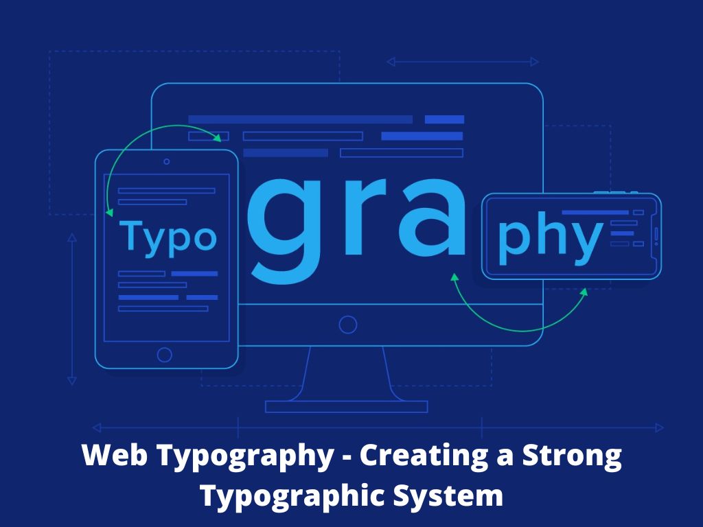
Web Typography – The usage of fonts on the World Wide Web is referred to as web typography. Font faces and styles were controlled only by the settings of each web browser when HTML was originally introduced. Until Netscape loped the font element, there was no way for individual Web pages to regulate font display. However, the font given by the font element must be installed on the user’s computer; otherwise, a fall back font will be used, such as the browser’s default sans-serif or monospace font. The first Cascading Style Sheets specification was published, which offered the same functionality.
Web typography, on the other hand, is a lovely art of website designing and arranging various sorts of web fonts, letters, phrases, and paragraphs to make outstanding web design according to priorities. Good web typography primarily aids a designer in establishing an efficient visual hierarchy and provides effective visual punctuation as well as graphic accents. Web typography makes it simple for online users to integrate text and graphics.
Improve your user interface by optimising your web typography in UI design. This article outlines a set of guidelines for improving the readability and legibility of your text.

Factors to Consider For Creating a Strong Web Typography System
Minimize the number of fonts used
A website that uses more than three different typefaces appears disorganised and unprofessional. Keep in mind that using too many different type sizes and styles at the same time might wreak havoc on a design.
In general, keep the number of font styles to a bare minimum and use the same ones throughout the site. If you’re going to utilise more than one font, make sure the families are compatible in terms of character width.
Line Length Limitations
The readability of your writing depends on the number of characters on each line. It should not only be a question of legibility that determines the width of your text; it should also be a matter of design.
You should try for 30–40 characters per line on mobile devices. You can get an appropriate number of characters per line in web design by limiting the width of your text blocks.

Colour combination of text and background
A bad pairing of text colour and background colour, in which the two do not contrast enough to maintain legibility, is a common source of frustration for web users. Avoid layering text over a similar-coloured background, and be cautious when placing text on top of images.
To emphasise a text snippet, combine colour with other styling (such as bolding, italics, or underlining).
Avoid using all caps
All caps does it in settings that don’t require reading, but don’t force your users to read all capitals text when your message requires reading. Except for decorative text, marketing, and the occasional set of headings, all caps is unnecessary in nearly all contexts.
Allow enough space between lines
Readers can better follow single lines of text and return to the next line after a line break if whitespace is used correctly. Vertical space is typically allocated by accessibility frameworks based on the font size of the text.
More than point size, line spacing influences the length of a document. Try adjusting the line spacing first if you need to fit a document onto a specific number of pages.
Text animations should be eliminated
Although animations attract the reader’s attention, but there are few things that are more distracting than flashing or moving text. You’ll understand why if you’ve ever tried to read a note held up to you it takes effort to stabilise it in our heads.
Entrance or exit effects are the only exceptions to this final rule. As a visitor scrolls, these can be a fun way of building an experience for them. However, once the text has appeared, it should remain static.
Make your text the right size
Instead of using points, web designers use pixels to specify font size. Because a pixel is a standardised unit on the internet, whereas a font point is not, two people reading text on the same website may see things depending on their devices or web applications.
When it comes to hierarchy, headings should be larger than body text, with H1, H2, H3, and so on decreasing in size. This makes it easier for readers to scan your pages for the content they’re looking for. You could also use different weights for your headings to create a stronger contrast with the body text.
Conclusion
The importance of web typography cannot be overstated. Bad typography might cause readers to lose interest in what they’re reading. Making typography readable, intuitive, and legible is critical.
If content reigns supreme, web typography reigns supreme. To create a well-designed website, simply evaluate all of the above-mentioned aspects. By incorporating human reviews into your web typography, you can rest assured that your website design will be a pleasant and inviting read.


