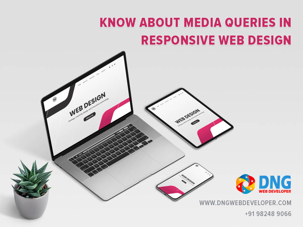
The CSS Media Query lets you use CSS only when the browser and device environment fit a predefined rule, such as “viewport is wider than 480 pixels.”. Media queries are an important part of responsive web design because they let you create different layouts depending on the size of the viewport, but they can also be used to detect other aspects of the environment in which your site is running, such as whether the user is using a touchscreen instead of a mouse. In this course, you will first learn about the syntax used in media queries, and then utilise them in a practical example to demonstrate how a simple design can be made responsive.

CSS Media Queries to Call Styles
The usage of media queries is another one of these techniques, which works by determining the dimensions of the user device before calling styles to it. There has been some discussion about whether media queries are the best option for mobile-first in the past, and that discussion continues today. RICG and W3C, on the other hand, have looked into ways to implement element queries, which some believe would be a superior approach. Why? That’s because they’re not viewport-dependent, but container-dependent. Media queries in responsive web design are a simple and effective approach to provide different content to a variety of devices, and the most typically used queries are those that deal with the viewport’s height and width.
Take Care With Performance
The use of media queries in responsive web design makes a site viewable across a wide range of devices and browsers. Given that media queries are not modular, there may be challenges with their design. You may find a plethora of internet tools to assist you, including code samples and frameworks.
You must understand performance and its influence on user experience (UX) and conversions while working with media queries in responsive web design. Users will become frustrated and abandon their purchases if a site takes too long to load. And the owner will suffer a significant loss of revenue as a result.
Because of the mobile revolution, we can no longer put up with a subpar web experience. Conditional loading can help you decrease the amount of content transmitted to a target device when building a responsive site.
The use of social media sharing buttons on websites, particularly on mobile devices, also causes performance issues. Three social buttons for Facebook, Twitter, and Google+ account for 19 requests and 246.7k bytes of bandwidth. This is why you should use web fonts instead of graphics on your home page for your social networking URLs and keep the number of social sharing buttons to a minimum.
Alternatively, you can utilise some plugins to speed up the social media sharing buttons. You may learn a lot about Media queries in responsive web design from numerous online tutorials.
How should media queries be written in CSS for responsive design?
This media query will only return results if they have a maximum width of 480 pixels (“only screen” in the original writing). If a match is made, the conditions will be executed and the HTML code will be altered.
Only the media type (and not media expressions) will be applied for media queries.
- all
- screen
- speech
/* For mobile phones: */
[class*="col-"] {
  width: 100%;
}

@media only screen and (min-width: 600px) {
  /* For tablets: */
  .col-s-1 {width: 8.33%;}
  .col-s-2 {width: 16.66%;}
  .col-s-3 {width: 25%;}
  .col-s-4 {width: 33.33%;}
  .col-s-5 {width: 41.66%;}
  .col-s-6 {width: 50%;}
  .col-s-7 {width: 58.33%;}
  .col-s-8 {width: 66.66%;}
  .col-s-9 {width: 75%;}
  .col-s-10 {width: 83.33%;}
  .col-s-11 {width: 91.66%;}
  .col-s-12 {width: 100%;}
}

@media only screen and (min-width: 768px) {
  /* For desktop: */
  .col-1 {width: 8.33%;}
  .col-2 {width: 16.66%;}
  .col-3 {width: 25%;}
  .col-4 {width: 33.33%;}
  .col-5 {width: 41.66%;}
  .col-6 {width: 50%;}
  .col-7 {width: 58.33%;}
  .col-8 {width: 66.66%;}
  .col-9 {width: 75%;}
  .col-10 {width: 83.33%;}
  .col-11 {width: 91.66%;}
  .col-12 {width: 100%;}
}
When the page is printed, the text with the class name heading will have a font size of 12 pixels according to the query above.
Media Feature Rules
For our web application to be responsive, we need to know the device’s screen size in order to render relevant content for that size. Rules for media features assist us in doing this. Using media features, we can pinpoint the cause of an issue and make adjustments to our website’s stylesheets. Despite the fact that there are several media feature criteria, we will focus on just a few that are critical for responsive design.
Width and Height Media Feature Rules
The viewport’s width and height should be checked first when thinking about media feature rules. The “width” property, “max-width” and “min-width” properties can all be used to identify bottlenecks in width operations.
How do you write media queries in CSS for Responsive design?
Media queries in CSS have a syntax similar to, which may be unfamiliar to a beginning web developer.
The media query can be accomplished as follows using the word “media”:
@media <media_type> connector ( <query> )
As an example given below:
This media query will only return results if they have a maximum width of 480 pixels (“only screen” in the original writing). If a match is made, the conditions will be executed and the HTML code will be altered.
Only the media type (and not media expressions) will be applied for media queries.
Unfortunately, there’s no defined standard for the page widths to target, but the following example responsive values are often used:
- 320px
- 480px
- 600px
- 768px
- 900px
- 1024px
- 1200px
@media screen and (max-width: 1200px) {
    .container {
        width: 100%;
    }
	.button{
		color:red;
	}
	.video{
		width:90%;
	}
}

@media screen and (max-width: 480px) {
    .container {
        width: 50%;
    }
	.button{
		color:green;
	}
	.video{
		width:50%;
	}
}
When the page is printed, the text with the class name heading will have a font size of 12 pixels according to the query above.
Media Feature Rules
For our web application to be responsive, we need to know the device’s screen size in order to render relevant content for that size. Rules for media features assist us in doing this. Using media features, we can pinpoint the cause of an issue and make adjustments to our website’s stylesheets. Despite the fact that there are several media feature criteria, we will focus on just a few that are critical for responsive design.
Width and Height Media Feature Rules
The viewport’s width and height should be checked first when thinking about media feature rules. The “width” property, “max-width” and “min-width” properties can all be used to identify bottlenecks in width operations.
Get good quality Responsive website Design from DNG WEB DEVELOPER in India. For best practice of CSS media queries you can use https://www.w3schools.com/css/css3_mediaqueries_ex.asp for fresher web developer. You can also find some good tips for website designing and CSS ideas for beginner web designer.


